Image Enhancer: How to Improve Photo Quality with AI
Learn how to improve photo quality by balancing exposure, color, noise, contrast, and texture with a controlled AI enhancement workflow.

Disclosure: This tutorial uses Vofy, an all-in-one AI creative studio, as the demonstration tool. The workflow reflects the app as available in July 2026, and its interface may evolve.
A photo can be technically usable and still feel visually unresolved. A phone portrait may combine a cool color cast, flat skin tones, bright background lights, and noisy shadows. A marketplace photo may have acceptable focus but weak separation between the product and the table. In these cases, fixing one isolated defect does not solve the whole image. The corrections have to work together.
That is the role of the Vofy Image Enhancer app: it is a broad finishing pass for a photo whose subject and composition are already right. Instead of chasing maximum sharpness or a larger file, the goal is to improve the hierarchy of the existing image. The subject should read sooner, light should feel intentional, colors should agree with one another, and texture should remain appropriate to the scene.
This guide focuses on that coordination problem. It shows how to turn a vague request such as "make this photo better" into a controlled enhancement brief, how to balance corrections that can work against one another, and how to keep a set of images visually consistent. Use only photos you own or have permission to edit. For archival material, keep an untouched master; the Library of Congress guidance on caring for photographs provides a conservative reference for source preservation.
TL;DR
- Use Image Enhancer when several modest issues affect the same photo: exposure, color cast, noise, weak contrast, and general softness.
- Describe the desired viewing experience first, then choose Auto Enhance, Low-Light Recovery, Restore Old Photo, Product Cleanup, or Sharpen Details.
- Rank corrections instead of maximizing all of them; stronger contrast, brighter shadows, and smoother texture can easily fight one another.
- Review the image twice: once for immediate visual hierarchy and once for mood, color, and texture consistency.
- Route a single dominant problem to a dedicated workflow: deblur for motion or focus failure, upscale for required output size, and shadow removal for a localized lighting defect.
1. When General Enhancement Is the Right Edit
General enhancement is useful when no single defect explains why a photo feels weak. Imagine a restaurant image shot near a window: the plate is slightly dull, the white napkin looks blue, the tabletop shadows are noisy, and the highlights on the glass are distracting. Sharpening alone will not organize that image. Brightening it globally may wash out the table. Removing all noise may erase the texture that makes the food look real. A successful enhancement has to decide which information deserves attention and which information should recede.
This makes enhancement a finishing decision rather than a rescue-at-any-cost operation. It is a good fit for social photos, listing images, travel pictures, menu photography, event coverage, and scanned memories that already communicate the right scene. It is a poor fit when the assignment is fundamentally different. If movement or missed focus is the dominant failure, follow the AI deblurring workflow. If a layout or printer requires more pixels, use the image upscaling guide. If one hard shadow is the only obstacle, a targeted shadow-removal workflow gives that problem the attention it needs.
The boundary is simple: choose a general enhancer when the whole image needs better balance. Choose a specialist when success can be measured by one technical outcome. Keeping those search intents separate prevents the broad enhancement pass from becoming a weaker version of three different tools.
2. Build a Photo Quality Brief Before Editing
A useful enhancement brief has three parts: the dominant distraction, the intended feeling, and the protected character. This is more precise than listing every slider you might adjust. For a rainy street portrait, the dominant distraction could be muddy facial tones; the intended feeling could be cinematic and cool; the protected character could be wet reflections and deep background color. For a ceramic product photo, the distraction could be a gray cast; the intended feeling could be clean and natural; the protected character could be the glaze color and soft window light.
Use this priority map to decide what the enhancement should do first:
| Quality dimension | Ask this question | Useful direction |
|---|---|---|
| Subject priority | What should the viewer notice first? | Improve separation around the subject without changing the background layout. |
| Tonal balance | Where is useful information being lost? | Open the midtones while retaining intentional deep shadows and bright accents. |
| Color relationship | Which color feels incorrect or distracting? | Neutralize the unwanted cast while preserving the scene's warm or cool mood. |
| Texture hierarchy | Which surfaces should feel detailed or smooth? | Keep fabric, hair, food, or product material readable without sharpening every surface equally. |
| Atmosphere | What gives the photo its character? | Preserve haze, grain, neon color, soft light, or age where it supports the image. |
The map forces a tradeoff. A night photo should not be processed as if daylight neutrality were the only sign of quality. An old scan does not need modern digital crispness to become easier to view. A product image can become cleaner without removing every natural reflection. Adobe's overview of color management also helps explain why a color decision should be judged in the context of the final screen or output, not as an isolated number.
3. How to Enhance Image Quality with Vofy in 3 Steps
The practical workflow turns the quality brief into one controlled pass. Each step answers a different question: what should lead, which correction strategy fits, and whether the final image still has the intended visual character.
3.1 Establish the reference look
Open Image Enhancer and upload the photo you want to finish. Before choosing a preset, view it at the size and against the background where it will be used. A portrait for a profile card may need clearer face-to-background separation. A wide travel image for a blog header may need controlled highlights so the headline remains readable. A listing photo may need a neutral product color more than dramatic contrast.
Write a one-sentence target based on that destination. For example: "Make the speaker easier to notice in the small card while keeping the warm stage lighting," or "Create a cleaner catalog look while preserving the cream color of the bag." This reference look gives the edit a visual purpose instead of a generic demand for more quality.
3.2 Choose a correction strategy
Use Auto Enhance when the brief calls for a balanced change across several dimensions. Select Low-Light Recovery when shadow readability and noisy dark tones are holding back an otherwise intentional night image. Choose Restore Old Photo when the character of a print or scan matters as much as clarity. Product Cleanup is suited to neutral commercial presentation, while Sharpen Details is appropriate when local separation is part of a wider quality pass rather than an attempt to repair severe blur.
Add one sentence that protects atmosphere or material character. "Keep the amber practical lights and deep blue exterior" is more useful than asking only for brighter exposure. "Preserve the matte paper and faded print character" prevents restoration from becoming a modern repaint. The preset chooses the general correction strategy; the preservation sentence defines its limit.
3.3 Review hierarchy first, finish second
Generate the enhanced image and perform a first-glance test. Look away, return to the image, and note what attracts your attention first. If the subject now reads clearly and the eye moves through the scene in a natural order, the broad enhancement is doing useful work. If the brightest area is an unimportant wall, a reflection overwhelms the product, or every texture competes equally, the image may be cleaner without being better organized.
Then perform a finish test. Compare the mood, skin or material color, shadow depth, highlight behavior, and texture hierarchy with the source and your brief. Rerun with a narrower correction if the image becomes too bright, too neutral, too smooth, or uniformly sharp. Download the result when it meets the intended use without losing the quality that made the original scene worth keeping.
Before

After

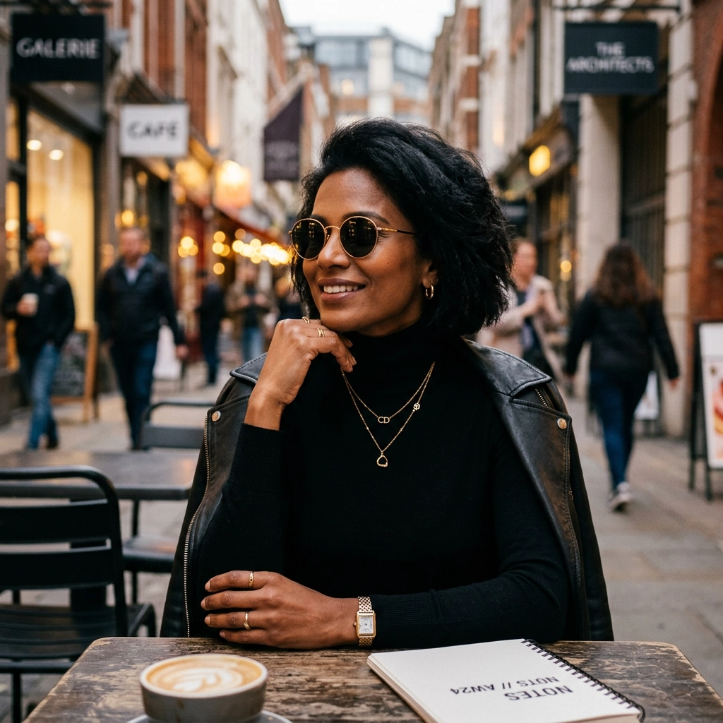
A real Image Enhancer comparison: the finished version improves exposure, contrast, and local clarity while retaining the original portrait and composition.
The comparison is most useful at two viewing distances. First, check whether the enhanced portrait reads more clearly at normal page size; then inspect whether the warmer skin, brighter midtones, and stronger texture still feel consistent with the source. The goal is not to make every part of the frame equally sharp, but to give the subject clearer priority without changing the scene's identity.
4. Balance Corrections That Compete
Photo-quality corrections are connected. Raising shadow detail can reveal color noise. Reducing that noise can remove subtle texture. Restoring texture can make skin or painted surfaces look harsh. Increasing contrast can give a product more presence while making its dark material look blocked. The strongest workflow does not push every property in the same direction; it assigns each correction a role.
For portraits, let facial separation lead while background detail remains quieter. Natural skin can contain small tonal changes, so perfectly even brightness is not always desirable. For food, texture and warm color may matter more than neutral whites. For interiors, retaining the difference between window light and room light often feels more believable than making every area equally bright. For products, accurate color and a readable silhouette usually matter more than cinematic atmosphere.
This is where the quality brief earns its place. When two corrections conflict, return to the destination and intended feeling. A moody event photo can tolerate dark corners but not a lost face. A marketplace image can tolerate a plain background but not an uncertain product color. The right tradeoff depends on the image's job, not on which version looks more processed.
5. Create Consistency Across a Set of Photos
Enhancing one image is a visual judgment; enhancing a set is a system-design problem. A seller may have twelve listing photos captured under slightly different light. An event recap may combine images from several phones. A family archive may include prints with different levels of fading. If every image is enhanced independently toward its own maximum impact, the collection can become inconsistent even when each file looks acceptable alone.
Choose one representative image and use it to establish the reference look for the set. Record the preset, the protected mood or color, and the final destination. Process the remaining images with the same priority order, then review them together as thumbnails. Differences in brightness, warmth, contrast, and subject prominence are easier to notice in a group than one at a time.
Consistency does not require identical treatment. A darker frame may need more recovery, and an old print may need less contrast than a recent phone image. What should remain consistent is the visual rule: similar whites, comparable subject prominence, compatible texture, and a shared sense of depth. Save the approved outputs separately from the masters, and name versions by their use, such as listing, profile, or archive-view, so a finished enhancement is not confused with the original.
6. Know When the Enhancement Is Finished
More visible processing is not the same as more quality. Stop when the subject reads at the intended size, distracting casts or tonal imbalances no longer dominate, important texture still looks appropriate, and the image fits beside the rest of the set. If you keep searching for differences only at extreme zoom, the next pass may solve a problem the audience will never see while creating one they will.
A second pass should have a new, limited purpose. For example, the first pass might establish balanced color and subject separation, while a second gentler pass addresses remaining low-light noise. Do not repeat the same broad instruction simply because the control is available. When only one local flaw remains, move to a targeted editor instead of reinterpreting the full frame.
The final test is practical: place the image in its destination. View the profile card, listing grid, article header, menu, presentation, or archive gallery as the audience will see it. If the image supports that context without calling attention to the edit, the enhancement is complete.
7. Conclusion
Improving photo quality is an exercise in visual priority. Define what the image needs to communicate, rank the corrections, preserve the atmosphere or material character, and judge the result in its actual destination. A strong enhancement makes the same scene easier to understand; it does not need to advertise how much processing occurred. When several modest defects are weakening an otherwise good image, try Image Enhancer with a one-sentence quality brief and stop when the image does its job.
FAQ
What should I write in an AI photo enhancement request?
Name the dominant distraction, the intended feeling, and one quality that must remain. For example: "Lift the muddy midtones and reduce shadow noise while preserving the warm stage lighting and dark background depth."
Should every enhanced photo look brighter and sharper?
No. Brightness and sharpness are tools, not universal goals. A night portrait may need readable facial tones while retaining dark surroundings, and an old print may benefit from gentle contrast without modern-looking crispness.
Can Image Enhancer correct color, light, and noise in one pass?
That is the main use case for a broad enhancement workflow. Use Auto Enhance for moderate mixed issues, then choose a targeted preset when low-light recovery, old-photo treatment, product presentation, or detail separation clearly deserves priority.
How do I keep a batch of enhanced photos consistent?
Establish a reference image, record its preset and quality brief, and apply the same priority order to the set. Review all outputs together as thumbnails to compare warmth, brightness, contrast, and subject prominence.
When should I use Unblur Image or Upscale Image instead?
Use Unblur Image when motion smear, camera shake, or missed focus is the main failure. Use Upscale Image when the destination requires a larger pixel output. Image Enhancer is better when several modest quality issues need to be balanced together.
Related Reading
Try it yourself on Vofy
Generate AI images and videos with the best models - all in one studio.
Discover More
 Priya Sharma•
Unblur Image: How to Fix Blurry Photos with AI
Learn how to diagnose motion blur, camera shake, and missed focus, then unblur an image with AI while preserving intentional depth and reliable detail.
 Priya Sharma•
Upscale Image: How to Increase Resolution with AI
Plan pixel dimensions for web, print, slides, and ecommerce, then use an AI image upscaler to create an output that fits the destination.

 Ryan Mitchell•
How to Remove Shadows From Photos: Quick Guide (2026)
Remove unwanted shadows from photos instantly with AI. Fix harsh lighting, clean up product images, and improve portrait quality without complex editing software.