AI Photo Effects: Choose the Right Edit for Your Image
Choose the right AI photo effect for focus, light, refraction, or framing, with real before-and-after examples and practical review checks.


Disclosure: Vofy is an all-in-one AI creative studio. This guide compares seven photo-effect workflows available through Vofy as of August 10, 2026. Generated edits can change small details, so review the result before publishing or using it commercially.
The wrong photo effect often solves a problem the image does not have. A portrait with a distracting cafe behind it needs cleaner focus, not stronger flash. A flat nightlife photo may need direct light, not more background blur. A product image with good lighting may only need quieter corners.
This guide compares seven AI photo effects by the part of the image they change: focus, light, refraction, or framing. It is not a guide to film grain, VHS texture, or color grading; those treatments belong in the retro photo effects comparison. Here, the goal is narrower: choose the edit that addresses one visible problem, then know what to inspect in the generated result.
TL;DR
- Choose Blur Image for general softness or motion, Add Bokeh for lens-like background depth, and Tilt Shift for a narrow miniature-style focus plane.
- Choose Cinematic Flash when the subject needs direct light; choose Light Leaks when an edge needs warm analog exposure.
- Choose Through the Water Style when ripples and refraction should become the main visual concept.
- Choose Vignette Effect when the center already works and only the outer frame needs less attention.
- Start with one effect. Inspect identity, text, product shape, and the effect boundary before considering a second pass.
1. Match the Effect to the Visible Problem
An AI photo effect is a generated edit that changes how viewers read an existing image while trying to preserve its subject and composition. The useful decision is not whether an effect looks dramatic in a gallery. It is whether the effect changes the part of your photo that is currently weak.
Use the table as a first-pass selector. The last column is the detail most likely to make an otherwise attractive output unusable.
| Visible problem | Choose | What it changes | Check first |
|---|---|---|---|
| Background competes with a person or product | Blur Image | General background softness or directional motion | Hair, object edges, and blur coverage |
| Existing lights should become photographic depth | Add Bokeh | Out-of-focus highlights and shallow depth | Face, glasses, labels, and light placement |
| An elevated scene should feel miniature | Tilt Shift Effect | A narrow or radial focus plane | Buildings, vehicles, and the sharp band |
| A dark or flat subject needs direct light | Cinematic Flash Effect | Highlights, contrast, and subject separation | Skin, eyes, pale fabric, and reflective surfaces |
| An empty edge needs analog warmth | Light Leaks | Edge flare, film-burn color, and halation | Face, hands, labels, and flare direction |
| The image needs a visible liquid concept | Through the Water Style | Ripples, caustics, and refractive distortion | Identity, straight edges, and existing text |
| Bright or busy corners pull attention outward | Vignette Effect | Smooth edge falloff and center emphasis | Center exposure, corner detail, and banding |
Two pairs deserve special attention. Blur and bokeh both soften a background, but bokeh depends on believable depth and highlight shapes; generic blur does not. Flash and light leaks both add brightness, but flash should illuminate the subject while a leak should enter from an edge. If you can state which of those behaviors you want, the tool choice becomes much easier.
2. Focus Effects: Blur, Bokeh, and Tilt Shift
Focus effects change what appears sharp and what recedes. They work best when the source already has a clear subject or a readable visual plane. They cannot reliably rescue a face hidden behind another object or reconstruct product detail that was never captured.
2.1 Blur Image for general softness or motion
Blur Image is the broadest focus tool in this group. Use it to soften a busy background, reduce secondary detail, create a gentle soft-focus finish, or add directional motion to a street or sports frame. Describe both sides of the boundary: Keep the person and red coat sharp; soften the cafe tables, signs, and pedestrians behind them.
In the example, the person stays readable while the cafe becomes quieter. Inspect the hair and shoulders rather than judging only the overall mood. A sharp halo or smeared edge means the background separation is not yet convincing.


Do not use generative blur as guaranteed privacy redaction. A generated area can look unreadable without proving that the original information is irrecoverable or fully covered. Use a deterministic mask or redaction tool when hiding a face, address, license plate, account number, or confidential document is the actual requirement.
2.2 Add Bokeh for lens-like depth
Bokeh is the character of the out-of-focus area, especially how small lights and reflections are rendered. Nikon's bokeh overview similarly separates the quality of the blur from the simple fact that a background is unfocused. Choose it for portraits, products, events, and night scenes where existing lights can become soft highlights.

Look for variation in highlight size and softness. A row of identical circles, a glowing cutout around the subject, or blurred glasses and jewelry makes the effect feel applied rather than photographed. When the background has no point lights and you only need less detail, choose Blur Image instead.
2.3 Tilt Shift for one deliberate focus plane
Tilt shift keeps a narrow band or radial area sharp while the scene falls out of focus around it. Adobe's Blur Gallery guide illustrates this focused region and its adjustable falloff. The effect is especially effective on elevated streets, traffic, train platforms, harbors, stadiums, and tabletop arrangements because those scenes already contain strong scale cues.


The sharp band should cross the part of the scene that matters. Check that buildings stay straight and cars do not merge at the blur boundary. For an eye-level portrait without visible scene depth, bokeh is usually the better choice.
3. Light Effects: Direct Flash or Edge Exposure
Light effects should answer where the brightness comes from. If the subject itself needs clearer illumination, use flash. If the subject already reads and an empty edge needs warmth or imperfection, use a light leak.
3.1 Cinematic Flash for direct subject light
Cinematic Flash adds the look of direct camera light: brighter front-facing highlights, stronger contrast, and clearer separation from a darker setting. It suits nightlife, event, fashion, creator, and product images where the source has enough detail in the face or object to withstand stronger highlights.


Review forehead and cheek highlights, eyes, jewelry, glass, white clothing, and glossy packaging. If those details are already clipped in the source, stronger flash may make the result less usable. Ask for a softer flash treatment instead of trying to repair blown highlights in a later pass.
3.2 Light Leaks for warmth at the edge
Light Leaks adds red-orange or golden exposure bleed, halation, and mild analog warmth around the frame. The effect works on portraits, travel images, campaign moodboards, social recaps, and cover art when there is open space beside the subject.


Specify the side when placement matters: Add a restrained warm leak from the upper-left edge; keep the face and title area clear. If the flare crosses both eyes, a product label, or the main hand gesture, reduce it or choose another edge. For grain, VHS, and broader analog styling, use the separate retro photo effects guide.
4. Refraction: Make the Optical Layer Visible
Through the Water Style is different from a color grade or light overlay. It introduces a visible layer between the viewer and the scene through ripples, water caustics, blue-green light, and refractive distortion. Use it when that liquid surface is the concept, not when the photo merely needs to look cooler or more polished.

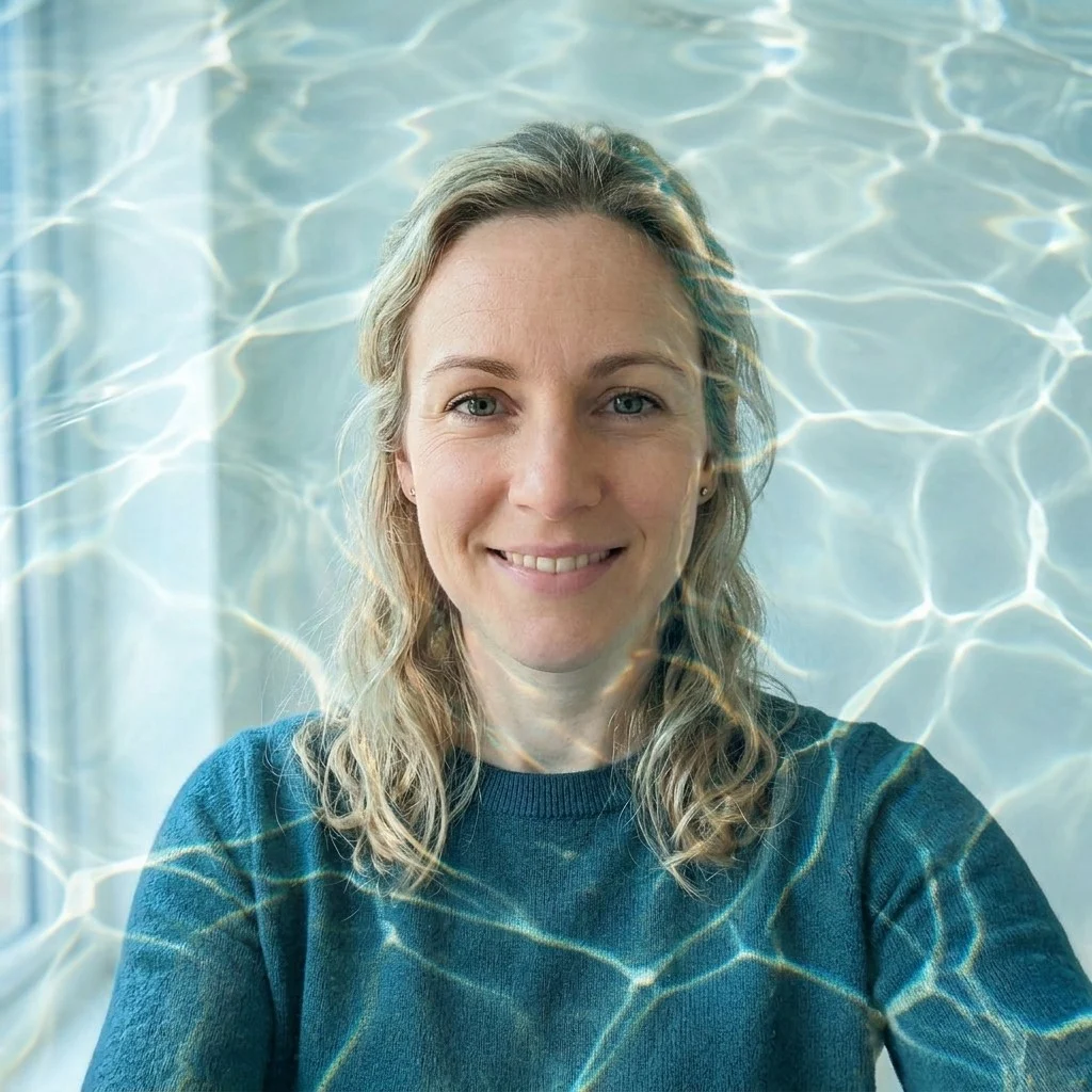
Place the strongest distortion over background, clothing, hair edges, or open space. Keep it away from eyes, mouths, product caps, straight packaging edges, and existing text. For a beauty campaign, a bent label or bottle silhouette is a production failure even when the water pattern looks attractive. Treat the result as concept art when exact geometry cannot change.
5. Framing: Use a Vignette Only When the Center Works
A vignette darkens or softens the perimeter so the eye moves toward the center. It is the quietest effect in this comparison and often works as a restrained final adjustment. It should not look like a black oval or compensate for a subject that is poorly placed.


Check the output at its final size. Dark corners that look subtle on a large monitor can become an obvious border in a profile image or thumbnail. Bokeh and tilt shift already establish strong focus hierarchy, so they often do not need an additional vignette.
6. Choose by Subject Type, Not Just Effect Name
The same effect can succeed on one subject and fail on another because the protected details change. A portrait is judged by identity and skin response. A product image is judged by geometry, material, and label accuracy. A city or travel scene depends more on architecture, horizon lines, and spatial depth. Make the subject type part of the decision before choosing a preset.
6.1 Portraits: protect identity before atmosphere
For portraits, start with the problem around the person. Choose bokeh when the background is busy but already contains depth and useful lights. Choose general blur when the background simply needs less detail. Choose flash when the face is readable but the lighting feels flat, and choose a light leak when the portrait already works and one edge has room for warmth. Through the Water is appropriate when visible distortion is intentionally part of an editorial concept; a soft vignette is appropriate when the face is centered and only the corners compete.
The protected list should stay short and concrete: face, hairstyle, expression, glasses, and one defining garment are usually enough. Inspect the eyes and mouth first, then hair and hands, then accessories. An effect can look polished at feed size while changing earrings, teeth, fingers, or a neckline at full size. If the image represents a real person in a professional, dating, or sponsored context, reject identity drift even when the overall lighting improves.
6.2 Products: preserve shape, text, and material
Product images have a stricter review order. First check silhouette and proportions, then cap, handle, seams, or other construction details. Next proofread every visible character. Finally compare material cues such as glass transparency, metal reflections, fabric weave, ceramic texture, and liquid color. A result that invents attractive packaging is not a faithful edit of the original product.
Bokeh and background blur are the safest starting points when the item already looks accurate and the environment is the problem. Vignette can add mild center emphasis, but it should not hide the bottom edge or darken brand colors. Flash can suit glossy campaign imagery, although it may clip white labels and reflective packaging. Water refraction works for exploratory beauty or beverage concepts, but any bent label or altered container shape should keep the output out of a product listing. Use a layer-based workflow when exact packaging must survive unchanged.
6.3 Streets, travel, and architecture: preserve spatial logic
Scenes are judged less by identity and more by geometry. Tilt shift needs a visible plane that viewers can understand, such as a road, platform, shoreline, stadium, or table. The effect fails when its sharp band crosses an irrelevant area or when buildings bend at the transition. Motion blur needs a direction that agrees with the action; a horizontal vehicle trail should not smear stationary signs in an unrelated direction.
Light leaks and vignettes can add atmosphere to travel images, but they should not erase landmarks or close off useful negative space for a caption. Through the Water can transform a landscape into a summer or dreamlike concept, provided the horizon and major structures remain intentional. When a location must be represented accurately for real estate, journalism, navigation, or documentation, avoid generative scene effects and use deterministic optical adjustments instead.
7. Diagnose the First Output Before Rerunning
Do not respond to every weak result by increasing effect strength. Identify the visible failure, then change the source, effect choice, or instruction that caused it. The correction should be narrower than the original request.
| Visible failure | Likely issue | Better next action |
|---|---|---|
| Subject has a bright cutout halo | Focus boundary is too aggressive | Ask for softer falloff and preserve hair or object edges |
| Every background light is the same circle | Bokeh lacks scene-aware variation | Reduce effect strength or use a source with clearer depth cues |
| Flash removes skin or fabric texture | Highlights are clipped | Choose soft flash or start from a better-exposed source |
| Light leak looks pasted over the face | Placement conflicts with the subject | Name an open edge and protect the face or label area |
| Water effect bends text or packaging | Distortion crosses exact geometry | Move ripples to background space or use a manual composite |
| Vignette forms a visible dark ring | Edge falloff is too narrow or strong | Request a wider, lighter feather or skip the vignette |
| Tilt shift blurs the actual landmark | Focus plane crosses the wrong depth | Describe the road, platform, building row, or object that must stay sharp |
Change one variable on the next attempt. If bokeh is too strong, reduce bokeh; do not also add flash and change the crop. If a light leak covers a face, move the leak before changing its color. When two controlled revisions fail in the same way, the source may not support that effect. Choosing another image is often faster and more honest than continuing to rerun an incompatible one.
8. A Short Workflow That Prevents Overediting
First, choose a source that already communicates its subject. Night lights support bokeh, an elevated city supports tilt shift, an open edge supports a light leak, and broad reflective surfaces support water refraction. The effect should strengthen evidence already present in the frame rather than invent all of it.
Second, write one change-and-protect instruction. For example: Soften the cafe and signs into natural bokeh; keep the face, glasses, and red coat unchanged. For a product: Add clear water caustics around the bottle; preserve its silhouette, cap, and white label. One visible change and two protected details are easier to evaluate than a long list of style adjectives.
Third, inspect the first output in this order:
- Subject: identity, anatomy, product shape, pet markings, or architecture.
- Exact details: existing text, logo, jewelry, glasses, labels, and straight edges.
- Effect behavior: blur boundary, highlight placement, flash exposure, ripple direction, or edge falloff.
- Delivery crop: whether the result still works as a thumbnail, listing image, poster, or profile picture.
Stop when the selected problem is fixed. A second generative pass can reinterpret details preserved by the first. Keep the source and first-pass export so you can compare whether the additional effect improved the image or merely made it busier.
9. When a Manual Editor Is the Better Tool
Use a manual or layer-based editor when the job requires exact masking, fixed numerical blur, repeatable settings across a large batch, pixel-perfect text or logo preservation, regulated product color, print production, or reliable redaction. Generative editing is useful when interpretation and variation are acceptable; it is the wrong tool when every pixel must remain accountable.
That boundary matters most for commercial products and documentary images. AI may preserve the overall bottle while changing tiny label text, or retain a person's face while adjusting jewelry and clothing seams. Review the original and output side by side. The guide to fixing fake-looking AI images provides a broader checklist for anatomy, materials, light, and composition.
10. Conclusion
Choose an AI photo effect by the visible problem: focus for competing backgrounds, light for flat subjects or empty edges, refraction for a liquid concept, and framing for distracting corners. The before-and-after examples show why effects with similar mood labels are not interchangeable.
Start with one edit, protect the detail that makes the image usable, and inspect the result before adding anything else. When you know which part of the frame needs to change, open the matching Vofy photo effect and make one controlled first pass.
FAQ
Will repeated AI effect passes change the subject?
They can. Each generative pass may reinterpret facial details, hair, jewelry, clothing, labels, or object edges. Keep the original and each accepted intermediate export, use one effect at a time, and compare protected details after every pass.
What should I do if the photo contains text or a logo?
Treat exact text and logos as high-risk details. Ask the edit to preserve them, then proofread at full size. If they must remain pixel-perfect, mask them out or add them again in a layer-based editor after generating the visual effect.
What source photos are poor candidates for AI effects?
Avoid sources where the subject is already hidden, severely compressed, clipped by the crop, or missing important highlight and shadow detail. Also avoid effects that contradict the scene: tilt shift on a flat headshot, heavy bokeh with no depth cues, or strong refraction over dense small text.
Which file type should I upload?
Use the highest-quality JPG, PNG, or WebP available. Resolution cannot restore detail that was never captured, but a clean source gives the edit better information about hair, product edges, architecture, and effect boundaries.
Can Blur Image safely redact private information?
Do not rely on generative blur for security-sensitive redaction. Use a deterministic redaction or masking tool that fully covers the original pixels, then inspect the exported file before sharing it.
Can I use an AI-edited result commercially?
Use only source images you own or have permission to edit, and check the current platform terms for your intended use. Review faces, products, trademarks, existing text, and potentially misleading changes before publishing a campaign, listing, or sponsored image.
Related Reading
Try it yourself on Vofy
Generate AI images and videos with the best models - all in one studio.
Discover More
 Emma Clarke•
Retro Photo Effects and Cinematic Looks: 8 Compared
Compare eight retro and cinematic photo effects, from film grain and VHS texture to light leaks, flash, vignette, and teal-orange color.

 Sofia Rodriguez•
Photo Color Effects Guide: Which Edit Fits Your Image?
Choose among eight photo color effects for recoloring, tinting, duotone, color splash, negative, neon, pastel, and rainbow edits.

 Ryan Mitchell•
Why AI Images Still Look Fake — and How to Fix It
Master advanced Nano Banana 2 techniques to fix fake-looking AI images. Learn the technical reasons behind common artifacts, physics-based solutions, and edge cases that separate amateur from professional photorealistic results.